
As accessibility becomes a crucial part of every application, Salesforce continues to enhance its platform by aligning with the Web Content Accessibility Guidelines (WCAG). Over the last few releases, Salesforce has rolled out multiple updates to base Lightning components, helping developers build more inclusive and user-friendly applications. In this post, we’ll explore two components that have recently received accessibility updates: lightning-input and lightning-modal. Learn more about Winter’s 25 Release. Learn about Improve Accessibility with Base Lightning Components -Winter’25 Release.
Why Accessibility Matters
Accessibility ensures that all users, including those with disabilities, can interact with your apps and websites efficiently. By making your Lightning components accessible, you improve the user experience for everyone. These updates apply to Lightning Experience and all versions of the mobile app, ensuring consistent accessibility across platforms.
Key Accessibility Enhancements:
Let’s see how to Improve Accessibility with Base Lightning Components -Winter’25 Release.
1. lightning-input:
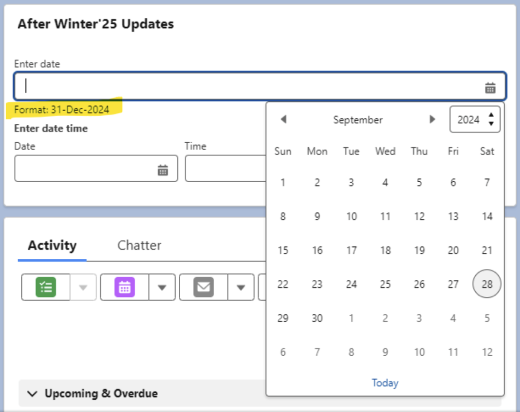
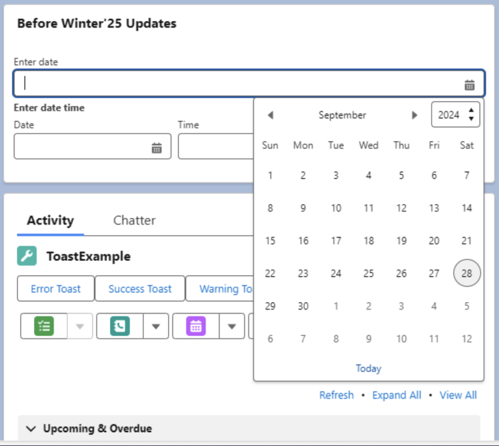
The lightning-input component now provides better feedback for input types date and datetime. Salesforce has introduced a subtle yet impactful change: the expected date format now displays below the text input field, guiding users who manually enter dates rather than using the date picker.
Example:
<template>
    <lightning-card title="Winter'25 Updates">
        <lightning-input type="date" name="dateInput" label="Enter date"></lightning-input>
        <lightning-input type="datetime" name="timeInput" label="Enter date time"></lightning-input>
    </lightning-card>
</template>
Previously, users would only see an error message if they entered an incorrect date format. Now, the expected format is proactively shown, reducing potential errors and improving clarity for users.
After Winter 25 Release:
Before Winter’25 release:
2. lightning-modal:
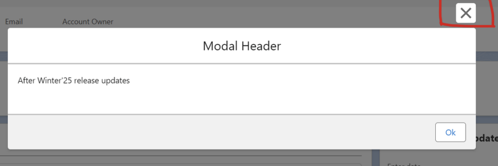
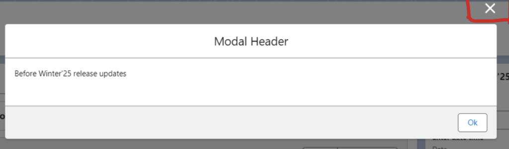
Another Enhancement is the update to the lightning-modal component. The close (X) button now displays with a white background, increasing its visibility and accessibility. In the past, the close button had a transparent background, making it harder to distinguish, especially for users with visual impairments. The white background now ensures that users can easily spot and interact with the close button.
Example:
parentCmpForModal.html
<template>
    <lightning-card variant="Narrow" title="Hello" icon-name="standard:account">
        <lightning-button variant="brand" label="Open Modal" title="titleName" onclick={handleClick}>
    </lightning-button>
    </lightning-card>
</template>
ParentCmpforModaL.js
import { LightningElement } from 'lwc';
import ModelPopUp from 'c/modelPopUp';

export default class ParentCmpforModalDemo extends LightningElement {

   async handleClick(){
        const res = await ModelPopUp.open({
            size: "small",
            description: "This is the Modal description Here"
        });
    }
}
modelPopUp.html
<template>
    <lightning-modal-header label="Modal Header"></lightning-modal-header>
    <lightning-modal-body>
        <p>After Winter'25 release updates</p>
    </lightning-modal-body>
    <lightning-modal-footer>
        <lightning-button label='Ok' onclick={handleOkay}></lightning-button>
    </lightning-modal-footer>
</template>
LightningModal.js
import LightningModal from 'lightning/modal';
export default class ModelPopUp extends LightningModal {

    handleOkay() {
        this.close("Okay");
    }

}
Additionally, the slds-button icon-inverse class is no longer applied to the close icon, further enhancing its visibility.
After Winter’25 Release:
Before Winter’25 Release:
Conclusion
By incorporating these accessibility updates, you can enhance your apps’ usability, ensuring that all users, regardless of their abilities, have a better experience. These changes not only help meet accessibility requirements but also make your applications more intuitive and user-friendly.
To stay updated with more accessibility features, keep an eye on upcoming release notes!
This post can serve as a great resource for fellow Salesforce developers to understand the significance of accessibility updates and how to implement them in their projects.